Working with Carbon Node data
Results from a Carbon Node are uploaded to LI-COR Cloud on the schedule (every thirty minutes by default). Widgets are used to display data from the Carbon Node. Widgets may be used to with default settings or customized to show parameters from multiple sensors and different parameters from the same station.
Overview of Dashboards
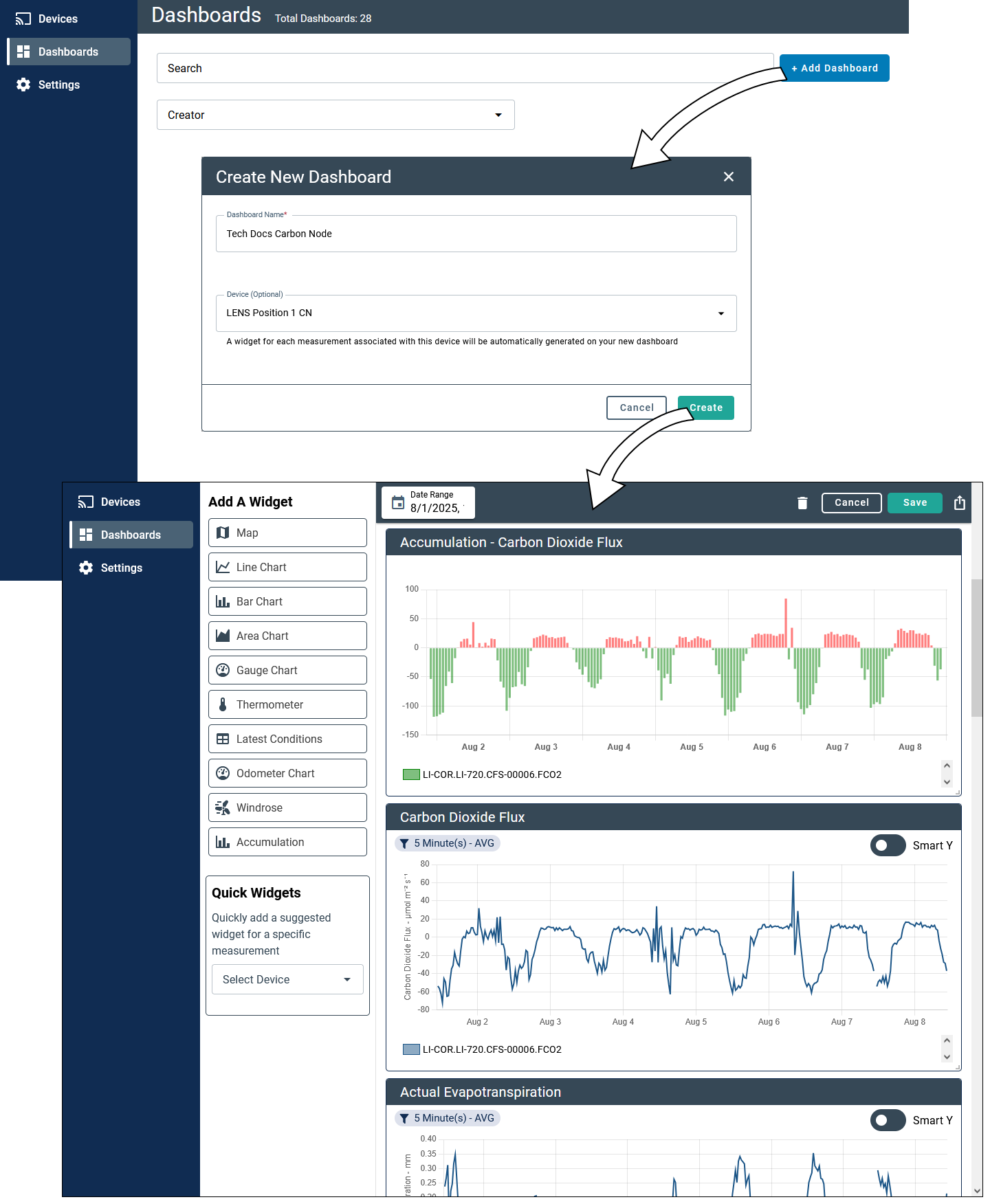
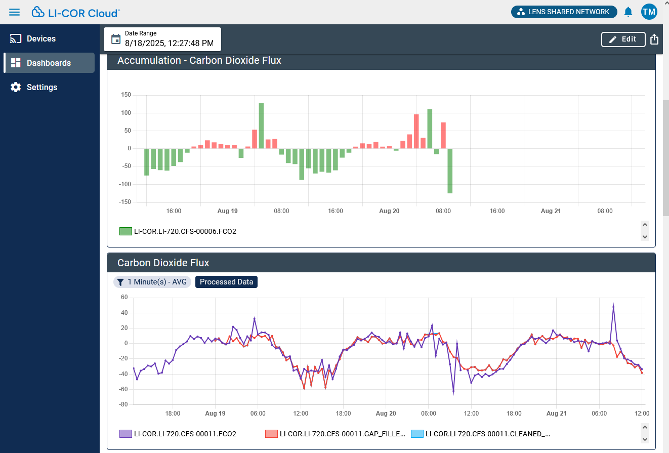
To view data from an instrument, you will create a Dashboard and add Widgets to it. LI-COR Cloud will show a variety of widgets by default. You can add, move, and re-size widgets to suit your preferences. For Carbon Nodes, two widgets may be of special interest: accumulation and gap filling.
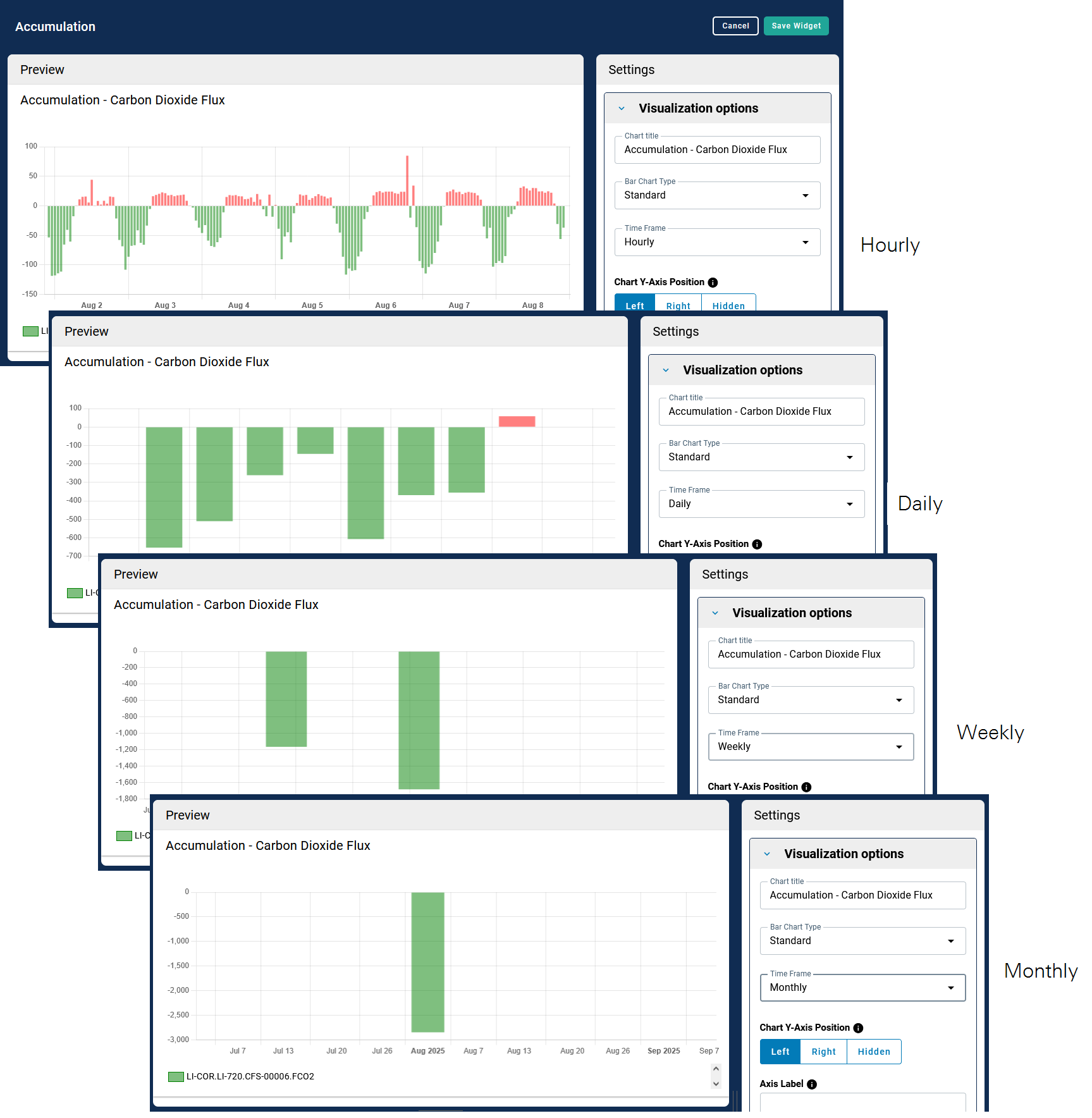
Accumulation widget
Accumulations can be computed for any variable. A chart of accumulations can show data from different instruments and parameters in the group. This maybe useful for comparison of measurements from multiple sensors or sites of different parameters that help interpret the data. To set up an accumulation widget:
-
Add a Dashboard.
Widgets relevant to Carbon Nodes will be added automatically after you select a Carbon Node, including the Carbon Dioxide Flux Line Chart and the Accumulation widgets.
-
Customize the Widget.
If you have saved the Widget, click Edit to view the Widget options. Then select the menu to view Chart Options. Use the Device Name and Measurement Type to constrain the list. This is to make it easier to find the parameter of interest. You can also search for measurements and constrain the date range.
The parameter will be added to a chart when selected.
-
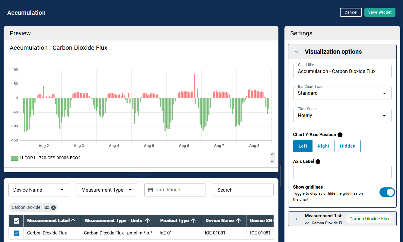
Configure the display Settings, starting with Visualization Options.
Under Bar Chart Type, you can choose Standard to display bars side-by-side or Stacked to display bars on top of each other. Under Time Frame, choose Hourly, Daily, Weekly, or Monthly to change the accumulation period.
-
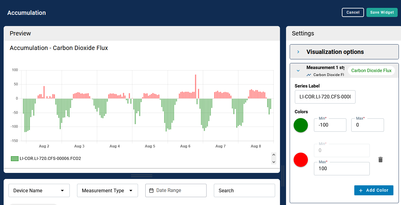
Apply more display properties
You can customize the y-axis label and position, and change the display parameters of each variable. You can apply threshold indicators to change the color of a displayed parameter if it is outside some configurable bounds.
-
Save the widget to display it on the dashboard.
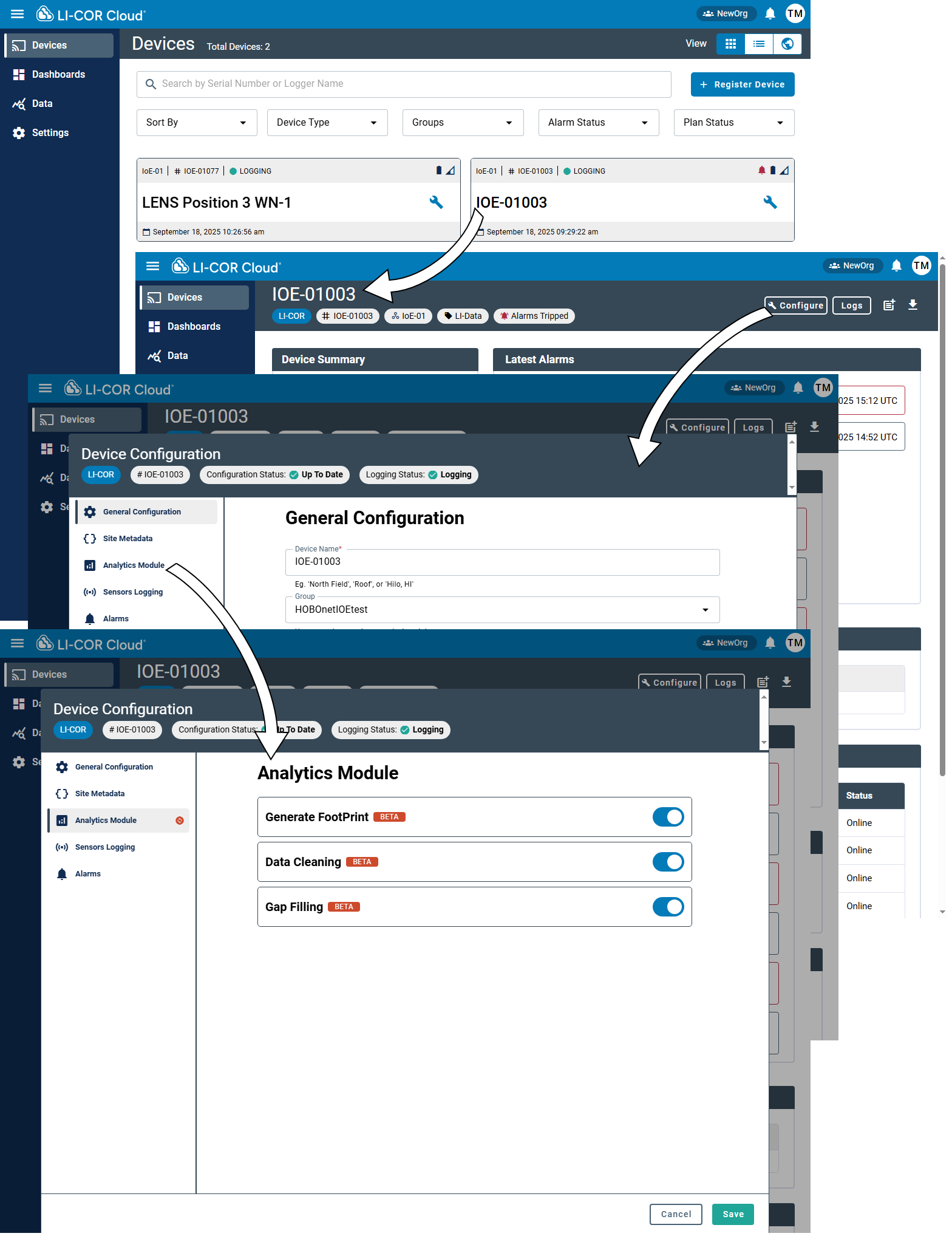
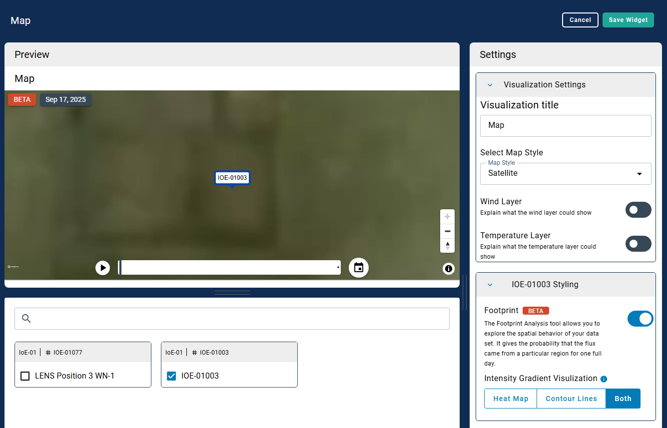
Data cleaning, gap filling, and footprint widgets
Data cleaning, gap filling, and footprints are available in the interface. For fluxes from a Carbon Node, gap filled data are presented as a line chart, featuring the same display options. The footprint is part of the map. To use the feature:
-
Enable the options under Device Settings.
-
Save the changes.
-
Add a Dashboard.
Widgets relevant to Carbon Nodes will be added automatically after you select a Carbon Node, including the Carbon Dioxide Flux Line Chart and the Accumulation widgets.
-
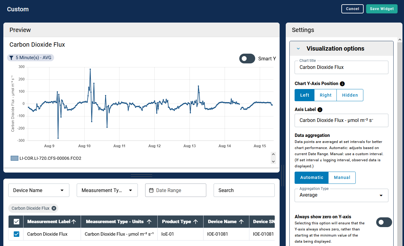
Add more variables and configure the display settings.

You can search for variables by device name, measurement type, and more. Display properties of each parameter can be changed to bring forth the most interesting aspects of the measurement.
-
Enable the footprint in the Map widget.
-
Save the settings and then save the Dashboard.
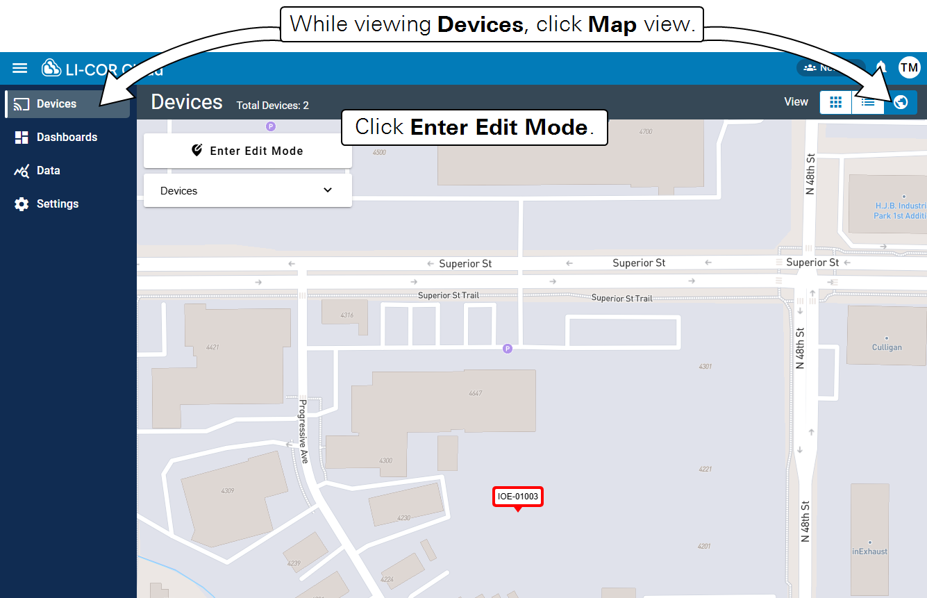
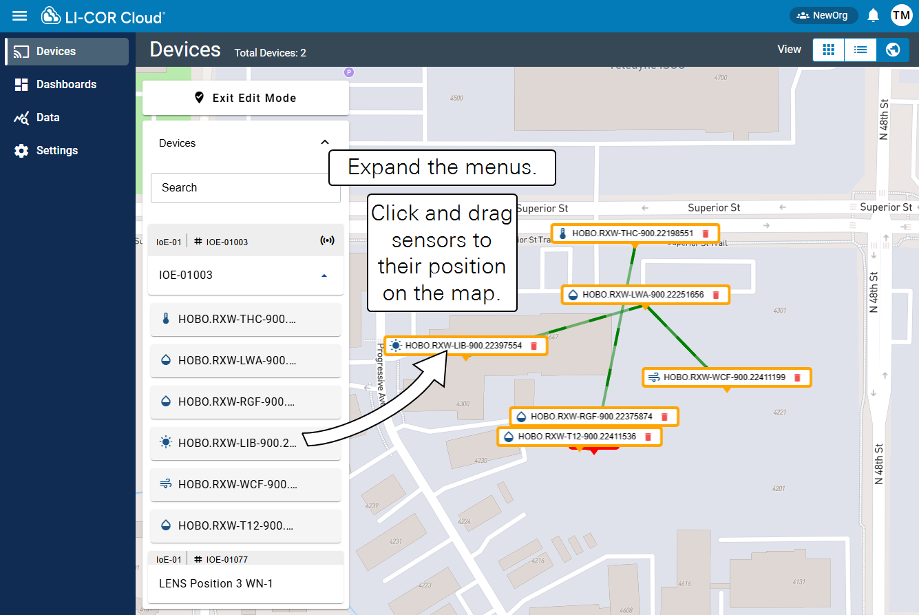
Adding RX sensors to the map
RX sensors that connected to the IoE Module via the Node Link can be displayed on the map. You'll need to specify the location of each sensor in the LI-COR Cloud interface. Follow these steps:
-
From the Devices tab, click Map view.
-
Click Enter Edit Mode to enable editing.
-
Expand the menus and click and drag each sensor to the position.
-
Click Exit Edit Mode to save the changes.