Log, chart, and details
The Log, Chart, and Details options provide a variety of tools to show details and chart data from observations or to view a log of your activity in SoilFluxPro Software.
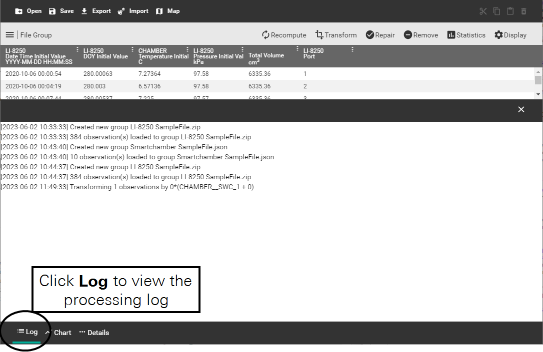
The activity log
The Log pane shows a running, timestamped history of operations that you have performed since opening SoilFluxPro. The log will also show any warnings, errors, or messages you have received.
Viewing a chart
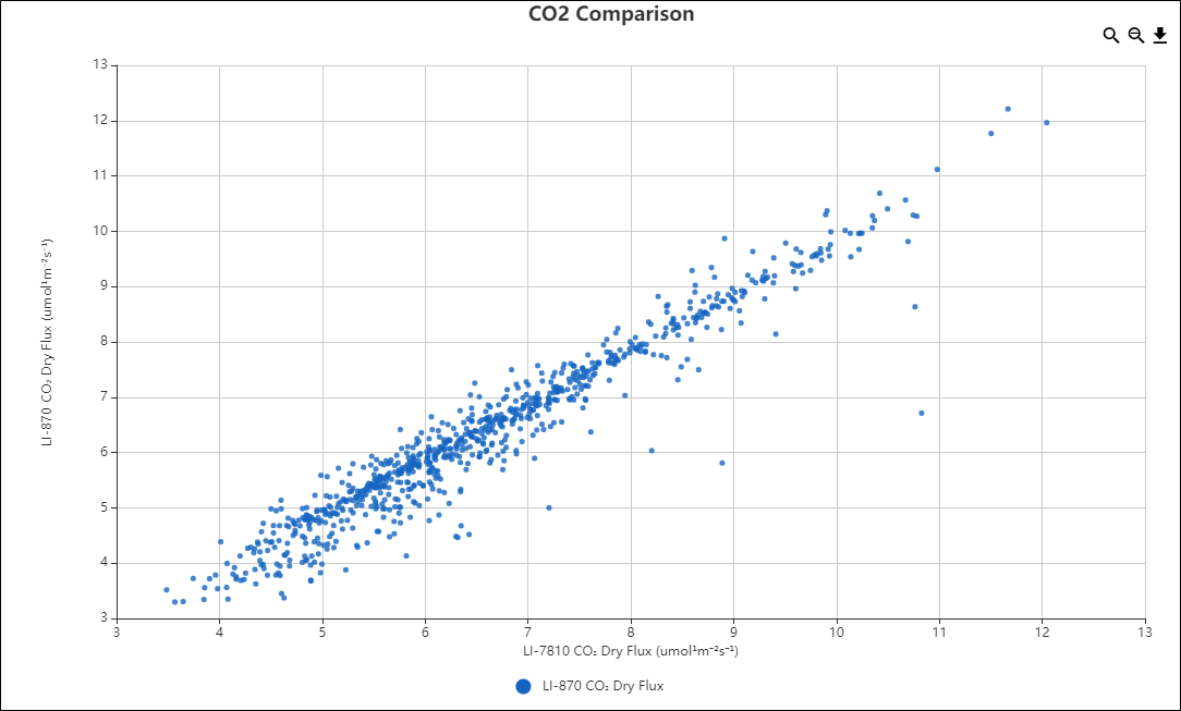
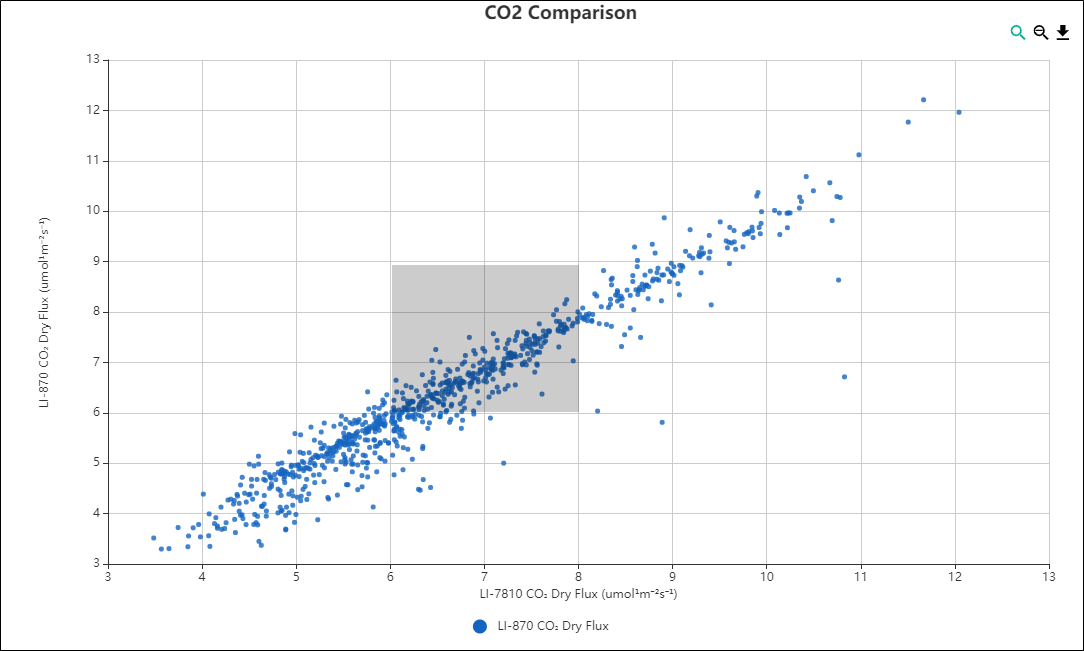
SoilFluxPro Software supports many charting features. The Chart pane enables you to generate charts for the dataset you have loaded. You can create charts for all or specific observations using any variable for the x-axis and y-axis. The variables available are organized the same way as those described in Configuring the display options.
Creating a chart
To create a chart:
- Select the observations you would like to have charted.
- Selected refers to observations that you have selected in the Summary view. You can tell which observations you have selected, as they will be highlighted in the Summary view. You can select observations individually by clicking on them, or you can use Ctrl + click to select multiple individual observations or Shift + click to select all observations in a range.
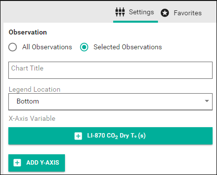
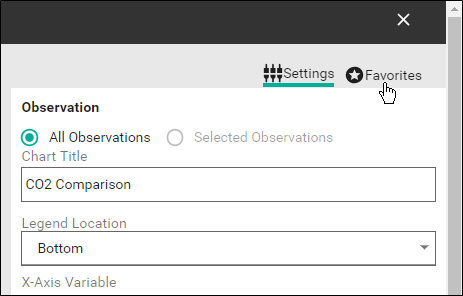
- You can provide a Chart Title and set the Legend Location.
-
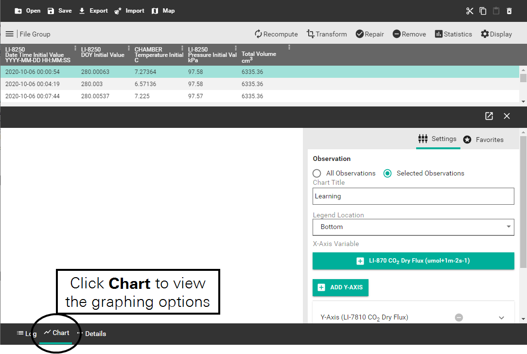
- Choose an X-Axis Variable by clicking Add
 .
. - This software will load the last X-axis variable you had active, so you may see a variable there when you open the Chart pane.
-
- Navigate to the variable you would like to add and click Confirm.
-
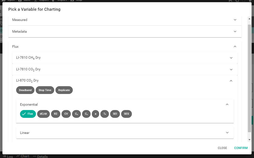
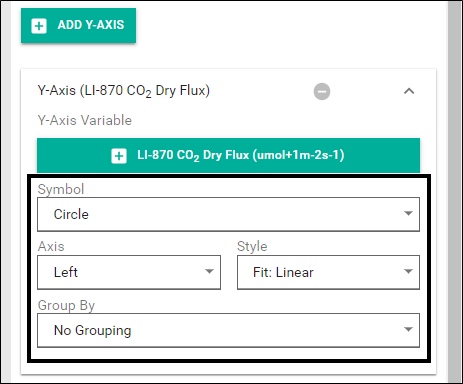
- Add Y-Axis variables by clicking Add .
-
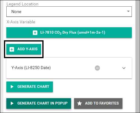
- Navigate to the variable you would like to add and click Confirm. Y-axis variables include a number of settings that can be applied to your chart.
-
-
- Symbol lets you choose from a number of different symbols to represent observations on a chart. This is useful when using two Y-axis variables.
- Axis determines on which side of the chart the variable units will appear.
- Style provides three options for how observations will be displayed on the chart: as a scatter plot, as a line chart, or as a scatter plot with a linear fit to the data.
- Group By allows you to group observations by Observation or Group By Tests Below. When grouped by observation, each observation appears in a different color and as a separate entry in the legend. Group By Tests Below is discussed in more detail under Grouping by test.
Note: You may have more than one Y-axis variable in your chart. Distinguish them by choosing different symbols. To remove a Y-axis variable, click the Delete Y-Axis variable ![]() button next to that variable.
button next to that variable.
- Click GENERATE CHART or GENERATE CHART IN POPUP.
Your chart will appear either in the empty pane next to the chart settings or in a popup window.
Grouping by test
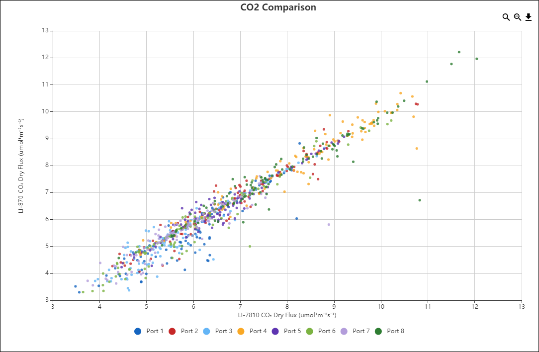
Grouping can also be done by one or more tests. Grouping by test lets you organize or sort how plotted data appear in your chart. For example, you could sort the datapoints in Figure 7‑2 by port number to visualize fluxes by port. To group by test follow the steps in Creating a chart to step 5, then:
- Under the Y-Axis select Group By Tests Below.
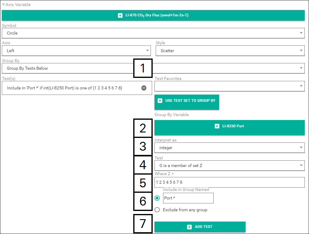
- Choose a Group By Variable. For this example, we will use Port from under the Metadata > LI-8250 drop-down.
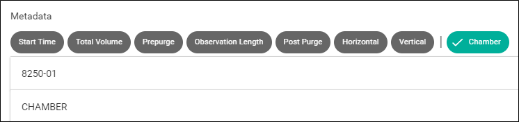
- To group by the port numbers on an 8250-01 Extension Manifold, you will need to use the dedicated Metadata variable called Chamber. This variable will bring up a list of multiplexer/extension manifold port number combinations for you to choose from.
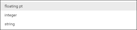
- Select an Interpret as option. In this case, Port would be an integer.
- Choose a Test to set the conditions for the test grouping.
- These options allow you set conditions on how your datapoints will be plotted. G is for the Group By Variable you selected in step 2 and Z will be entered in step 5.
- G is a member of set Z will include/exclude G (the variable) if it is one of the Z values. This is the Test we will use for this example.
- G < Z will include or exclude G if it is less than Z.
- G <= Z will include or exclude G if it is less than or equal to Z.
- G == Z will include or exclude G if it is equal to Z.
- G >= Z will include or exclude G if it is greater than or equal to Z.
- G > Z will include or exclude G if it is greater than Z.
- G not already in a group will capture any datapoints that do not meet any other criteria.
- Indicate the value Z represents in the Where Z = field.
- Separate multiple values with a space. For this example, we would like to see datapoints from each port. Z would then need to correspond to the port number. So, we enter Z as 1 2 3 4 5 6 7 8 because this system has a chamber on all eight ports.
- Select whether to Include in Group Named or Exclude from any group.
- If you choose Include in Group Named, you will need to enter a name for the group. You can provide any name you like but if you add an asterisk (*) after the name, SoilFluxPro will automatically create a new group for each value of G. For instance, we will enter the name as Port *. This will add a new group (color-coded) for each port.
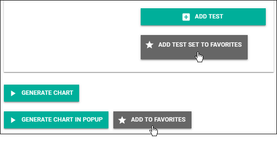
- Click ADD TEST.
- This will add the test for SoilFluxPro to reference when generating the chart.
When you click GENERATE CHART or GENERATE CHART IN POPUP you will now see your datapoints grouped by port number as seen in Figure 7‑3.
Interacting with a chart
Charts offer a few tools for working with them.
Zoom in
The Zoom In ![]() button allows you to zoom in on a specific portion of the chart you would like to see more closely—especially where datapoints can be tightly grouped. When you click the Zoom In button, your cursor will turn into a reticle. Click and drag the reticle across the region you would like to zoom in on. You can zoom multiple times.
button allows you to zoom in on a specific portion of the chart you would like to see more closely—especially where datapoints can be tightly grouped. When you click the Zoom In button, your cursor will turn into a reticle. Click and drag the reticle across the region you would like to zoom in on. You can zoom multiple times.
Zoom out
The Zoom Out ![]() button will go back one level on the zoom. If you have only zoomed in once, the view will return to 100% zoom.
button will go back one level on the zoom. If you have only zoomed in once, the view will return to 100% zoom.
Arrow Keys
When charting raw data from a single observation, the up and down arrow keys on your keyboard allow you to cycle through observations.
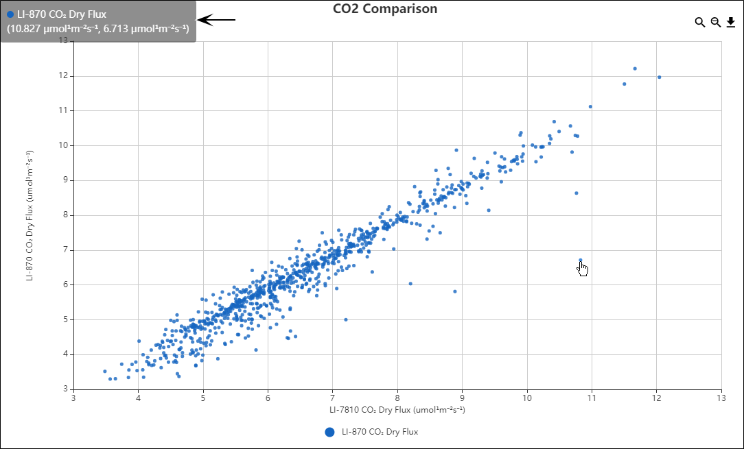
Datapoint hover
Hovering your cursor over a datapoint will display details about that datapoint in the upper left corner. This is useful for getting details about outlying datapoints.
Save image
Clicking on the Save As Image ![]() button will save the current view of the chart as a .png file to the destination you choose.
button will save the current view of the chart as a .png file to the destination you choose.
Saving your favorite chart settings
SoilFluxPro can save Chart settings and Tests you use frequently as favorites. Favorites let you quickly apply a chart setting to other datasets later. There are a few predefined chart favorites that can be selected but there are no predefined tests.
Adding a favorite
Adding a favorite takes just a few steps. Once you have entered your settings as you want them, click ADD TO FAVORITES or ADD TEST SET TO FAVORITES at the bottom of the page.
You will receive a notification that your favorite has been added.
The Chart Title or test conditions you provided will be used as the name of the favorite.
Applying a favorite
To apply a favorite that you have saved or one of the predefined charts, open the Favorites tab.
Select the favorite you would like to apply from the Chart Favorites or Test Favorite drop-down.
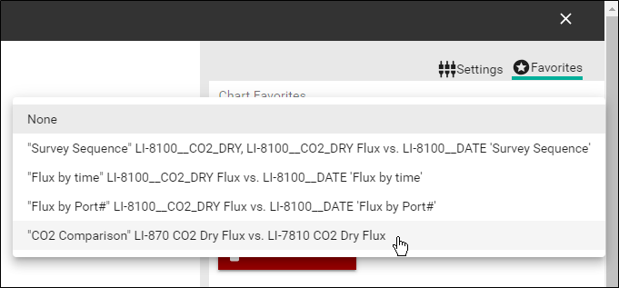
Click APPLY FAVORITE.
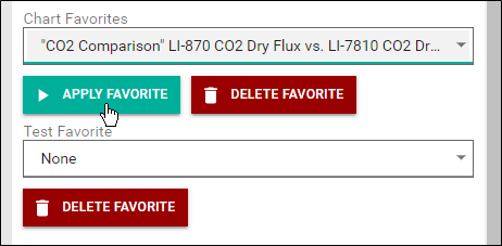
The chart will generate in the empty pane automatically. If you'd like to generate the chart in a popup, go back to the Settings tab and click GENERATE CHART IN POPUP.
Note: To delete a favorite, select the favorite from the Chart Favorite or Test Favorite drop-down and click DELETE FAVORITE.
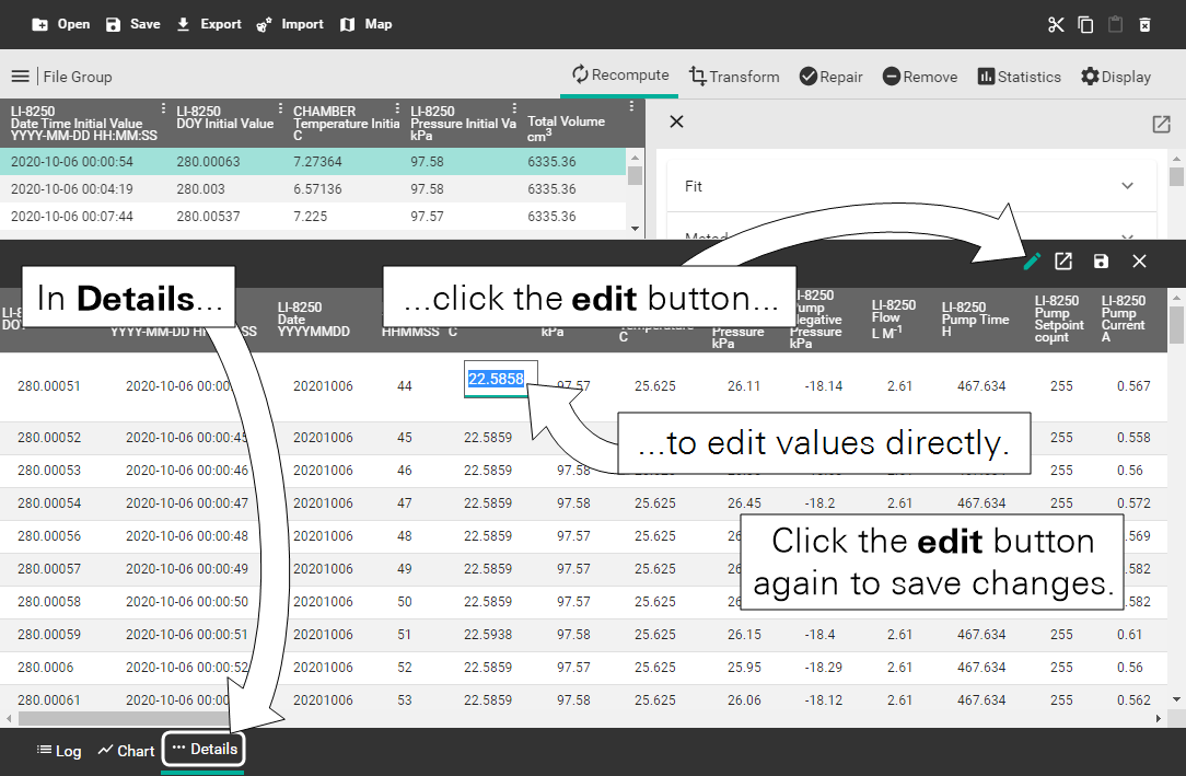
Selecting the Details pane provides you with the raw time series data for a single observation. Details include all variables measured by all devices for each second of the observation. The variables on this page use a header structure similar to the one described in Summary table.
Note: Not all observations will display the same variables. The columns in Details are based on the maximum variable set. If an observation does not have the same variable as another observation, you will see a value of -9999.
Data and measurement details
The Details pane allows you to edit values, but you cannot move things or sort the columns.
Save
You can save this data as a .csv file to view it in another application. To save the details of an observation, click the Save button in the upper right corner.
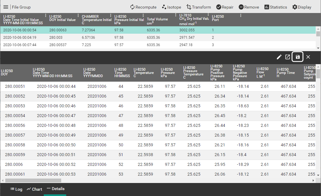
Select the destination where you would like to save the file, enter a name for the file, and click Save. You will receive a notification at the bottom of the page that the file was saved.
Edit
Values in the Details view are editable.