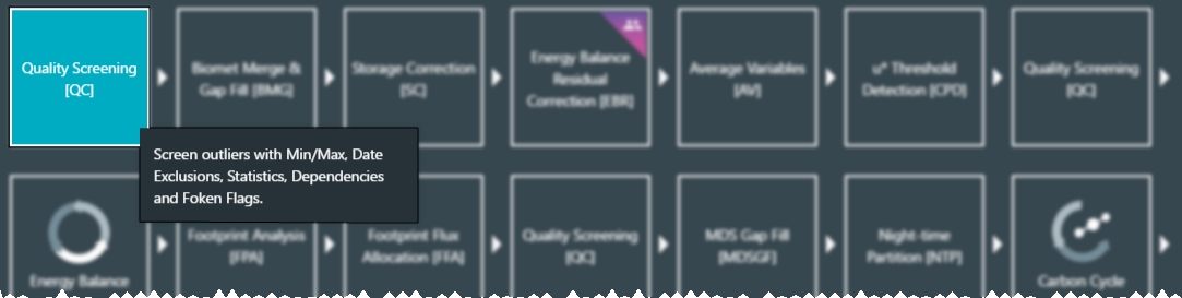
Eddy covariance data sets usually contain some poor-quality data that must be excluded from further analysis. Failure to exclude poor-quality data may introduce significant bias in the final results. The Quality Screening (QC) tool is used to examine data, filter poor-quality values, and create exclusion zones that can, for example, omit dates for a particular variable.
It should be noted that while the bulk of the quality control should be done immediately after the data has been imported, the quality control checks may need to be re-applied at any point in the subsequent processing stages. There are two reasons for this. First, subsequent processing may introduce bad data such as spikes if the algorithms are not robust (e.g., division by very small numbers). Second, any gap filling that involves statistical transformation of data is susceptible to bad data (or noise) in the data set being processed. This means that data points considered borderline during an early stage of processing may show up as bad in later stages of processing.
Bad data can manifest itself in many different ways, and there are a plethora of possible causes. As a general rule, there is no single check that can identify bad data, no single test that can be applied to remove all bad data and no foolproof way to remove all bad data and no good data. Often, the distinction between good and bad data will be so subtle that you will end up removing some good data and leaving behind some bad data. An effective use of the QC process will minimize the former and maximize the latter.
Tovi offers a number of ways to deal with these constraints, including a number of generic tools for semi-automated removal of bad data in bulk and a tool for manual removal of the bad data that remain after the semi-automated procedures have been used. In addition, it provides interactive graphical tools to evaluate the results as they are computed.
Tovi's semi-automated tools for bulk removal include:
- Rejection of implausible values based on minimum and maximum. Many of the variables in EC data sets have well defined ranges for plausible values. For example, incoming shortwave radiation will rarely exceed the solar constant (1356 W/m2) and then not by much. Likewise, it will never drop below 0 W/m2 except for instrument offsets and these should be small. Globally, we can assert a range of -10 W/m2 to 1500 W/m2 and much narrower ranges can be used locally depending on latitude. Plausible ranges can also be specified for most other variables by default and then tuned for individual sites. See Screening minimum and maximum values.
- Rejection of implausible values based on quality flags as provided by EddyPro. Those flags are based on the well-known and widely adopted "Foken tests", which test raw EC datasets for stationarity and for well-developed turbulence conditions. Flags provide three levels of quality estimate, allowing to remove only "bad data" (Flag 2) or also "intermediate quality data (Flag 1) depending on the aim of the analysis. Data of highest quality are flagged with Flag 0 and can be retained for any analysis purposes. See Screening based on quality flags.
- Rejection of flux values when friction velocity (u*) is too low. This tool is used to eliminate data that can potentially be biased by undetected but significant advection. See u* threshold detection.
- Rejection of flux values based on the fraction of flux footprint from the target area. See Footprint allocation.
- Rejection of data based on another variable (dependency). Many of the variables in EC data sets are dependent on other variables. For example, the quality of fluxes calculated from an open-path IRGA data is dependent on precipitation, fog, or dew since these obstruct the optical path. Note that in theory it is possible for the dependencies to be nested to an arbitrary level (variable A depends on variable B, which depends on C, etc.) and to even be circular. In practice, a single level of nesting has been found to be completely adequate. Note that this automatically excludes circularity. See Screening based on dependencies.
Sometimes, it is not possible to remove all bad data using the semi-automated tools and you must resort to more time-consuming, but more precise, manual tools. The manual QC tools include:
- Exclusion of dates and times. You can specify, either by choosing a region on a time series plot or by manually entering a date range, to reject all data between a start date and time and an end date and time. There can be an arbitrary number of date ranges for any data set. Individual data points can be excluded by specifying a date and time range with the same start and end values. See Screening date ranges.
The balance between semi-automated and manual QC tools is an optimization problem that must be solved based on individual circumstance and the end use of the data. More reliance on semi-automated methods will reduce the time taken but may increase the proportion of good data rejected in order to achieve a satisfactory rejection rate for bad data. More reliance on manual methods will increase the time taken but may decrease the proportion of good data rejected while achieving a satisfactory rejection rate for bad data.
Starting a QC sequence
Quality screening can be done all at once or in smaller steps. Here, we describe how to carry out a number of QC steps, starting with the RAW data node. To create the sequence:
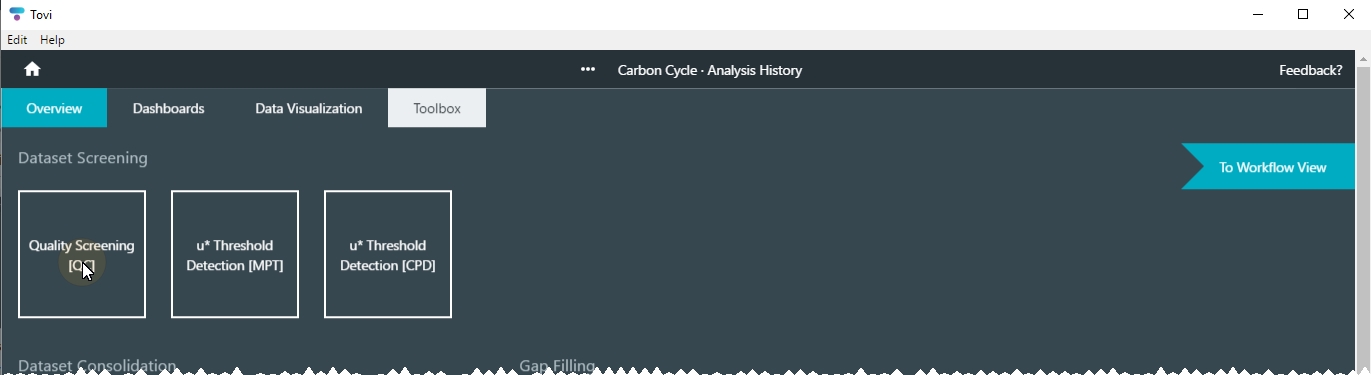
- In the Overview > Analysis History, select the node that represents the data to evaluate.
- If you are starting the analysis, the Raw node is the only one available, but as you work with a data set you will have other nodes.
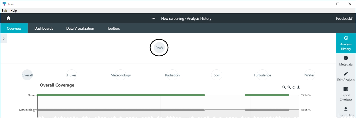
- Click Toolbox > Quality Screening (QC) to initiate the quality screening.
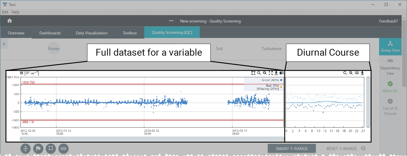
- Now you'll be able to screen and filter the data in a number of ways.
- The full dataset for a variable is on the left, with the date on the horizontal axis. The diurnal course is on the right, with the hour of day on the horizontal axis.
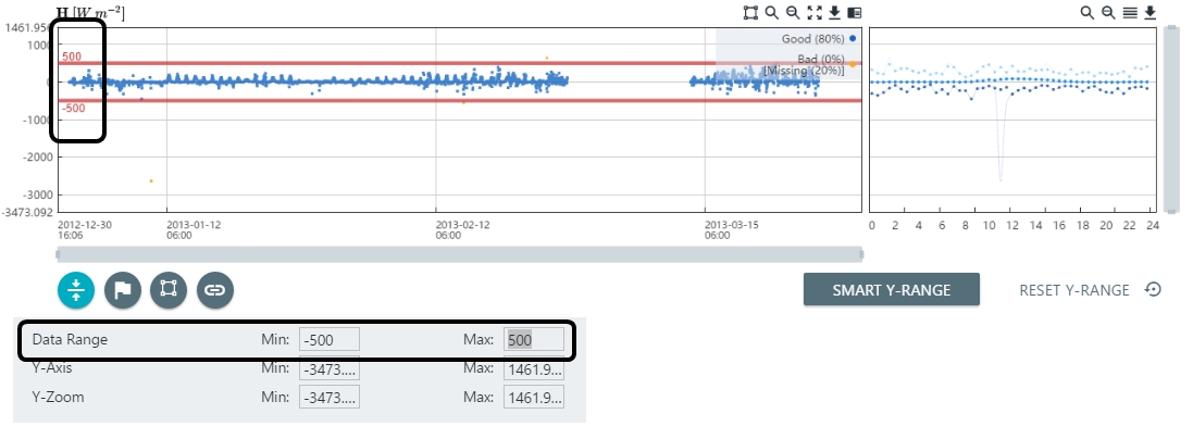
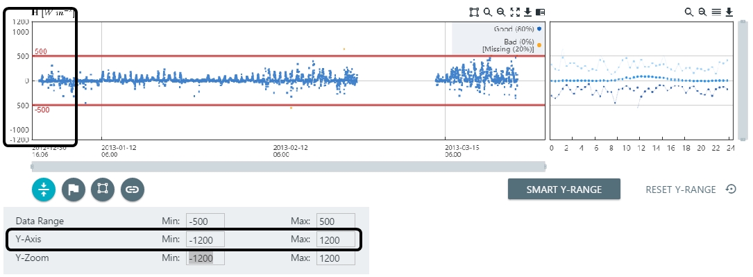
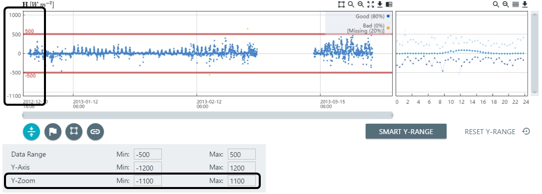
Screening minimum and maximum values
You can configure the Y-range filter parameters according to your preferences.
- Click the Y-Axis options button (
 ).
). - You can set the Min and Max for the Data Range, Y-axis range, and the Y-zoom range.
- Adjust the Data Range by editing the Min and Max values.
- Adjust the extent of the Y-Axis.
- Adjust the Y-zoom.
- The Y-zoom is constrained to be within the Y-axis range.
- Either continue with more quality screening steps or click Done QC and tag the screening node.
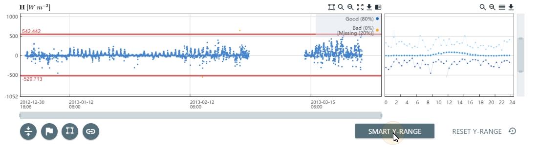
Screening with the smart y-range
The smart y-range is a way to bring both the zoom level and the minimum and maximum lines down to where the bulk of the data is found. It is most useful when there are one or more large outliers in the dataset, that extend the zoom and minimum and maximum ranges, and make it impractical to zoom-in until most of the data is clearly visible. The Smart Y-range is computed statistically as the median ±10 times the interquartile range (IQR) computed on the entire dataset. Once you've clicked the SMART Y-RANGE button, you can still sey the minimum and maximum lines or zoom levels to fine-tune the settings.
With datasets without major spikes, the Smart Y-Range may be less optimal than the starting point. In that case, simply click on RESET Y-RANGE to undo the smart y-range.
- Click Smart Y-range.
- Either continue with more quality screening steps or click Done QC and tag the screening node.
Screening date ranges
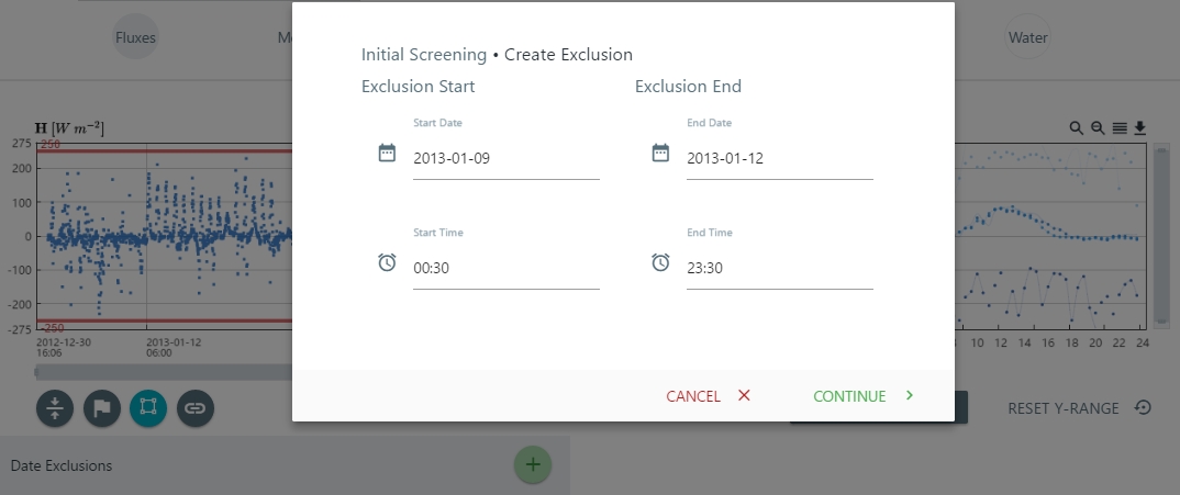
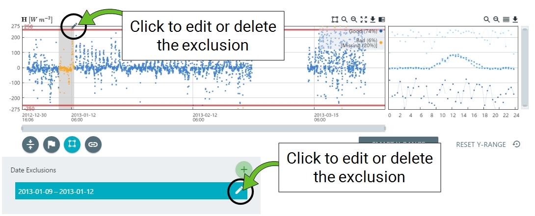
You can specify dates to exclude, which is done by drawing an exclusion zone or specifying dates and times to exclude.
- To draw an exclusion, click the Draw Exclusions button (
 ), and then click and drag to select the time frame to exclude.
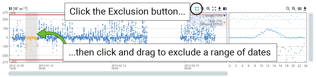
- To select the exclusion dates manually, click the Date Exclusions button (
 ).
). - Click the (+) icon to set the dates.
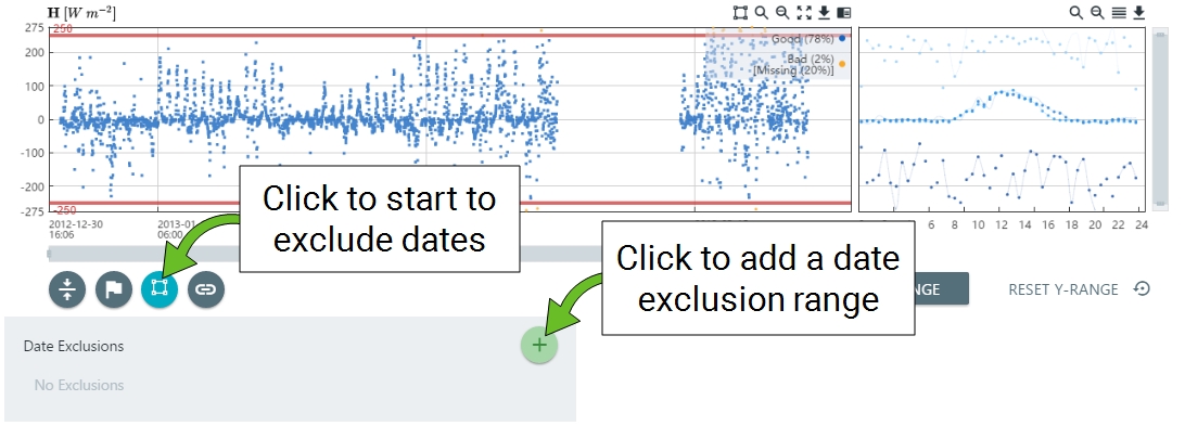
- Create a new exclusion by selecting the dates and times.
- You can edit it or delete the date exclusion zone.
- Either continue with more quality screening steps or click Done QC and tag the screening node.
Screening based on dependencies

Tovi provides a way to set dependencies of variables upon other variables. The dependency setting allows you to make the acceptance or rejection of data in one (dependent) variable conditional on the acceptance or rejection of data in one or more other (independent) variables. An arbitrary number of independent variables can be specified. The dependency check in Tovi is a single level deep, that is, it cannot be nested.
Under Toolbox > Quality Screening (QC), select Dependency View.
- Select a dependent variable.
- The list will include variables available in your dataset. Upon selecting a dependent variable, Tovi will display a chart of the data and charts of the other variables that it depends upon. You can use this information to guide your decisions to screen the data.
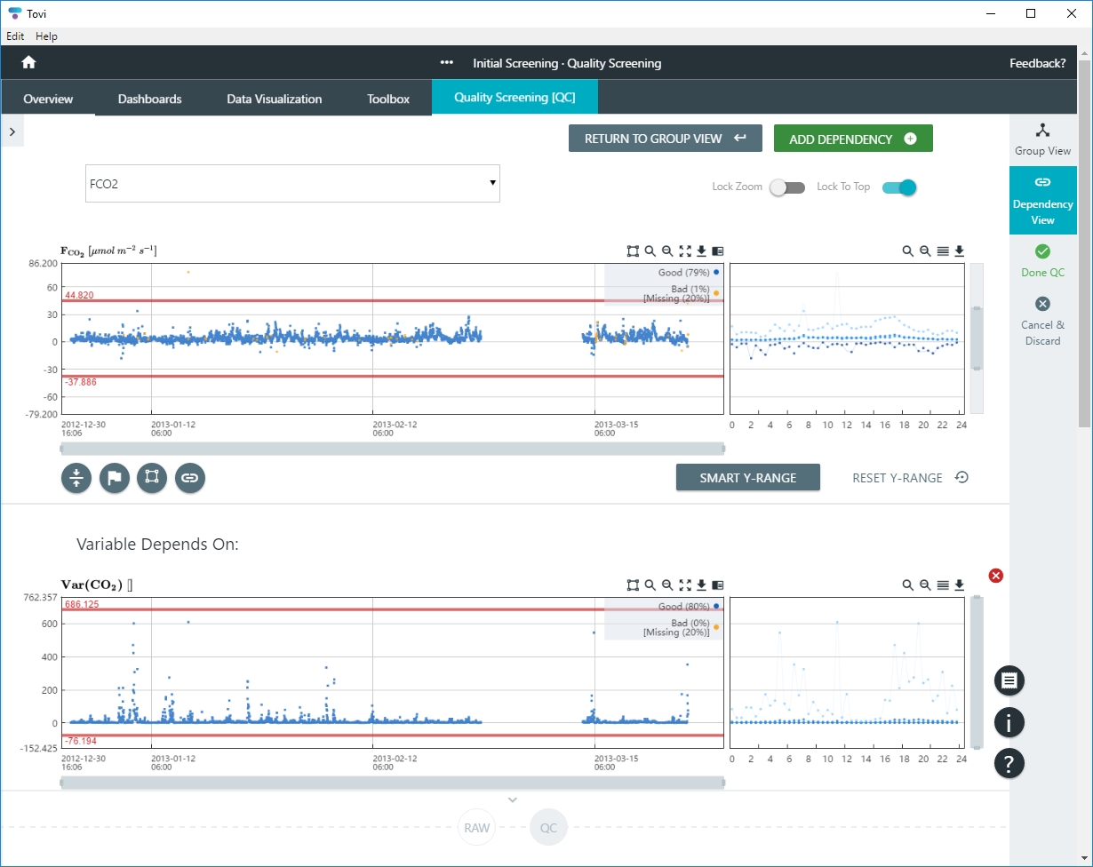
- Click ADD DEPENDENCY to add another dependent variable.
- In Dependency View, you can lock the zoom (Lock Zoom) for all of the graphs currently displayed, and lock the dependent variable to the top of the display window (Lock to Top).
Screening based on quality flags
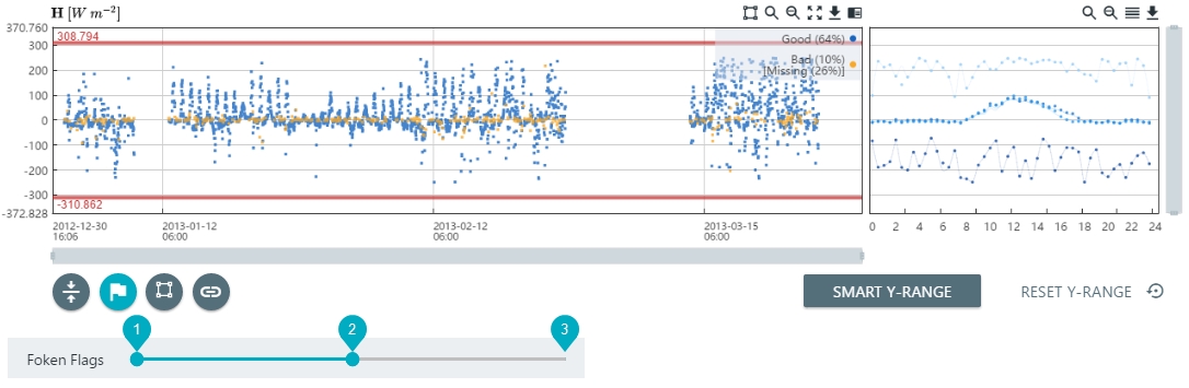
Screening on quality flags allows you to filter flux data based on flags generated by EddyPro during the flux computation. Quality flags are only available for flux variables, including evapo-transipration flux (ET, found in the Water group). In this example, we use the Foken flags with values of 0, 1, and 2 for high quality, intermediate quality, and low quality.
- Click the Quality Flags button (
 ).
). - Adjust the slider so that it includes only the desired flag values.
- In this example, we omit values that are flagged as 2 (poor quality) and include values that are flagged with 0 and 1.
- Repeat this for any other fluxes that you want to screen.
- Either continue with more quality screening steps or click Done QC and tag the screening node.
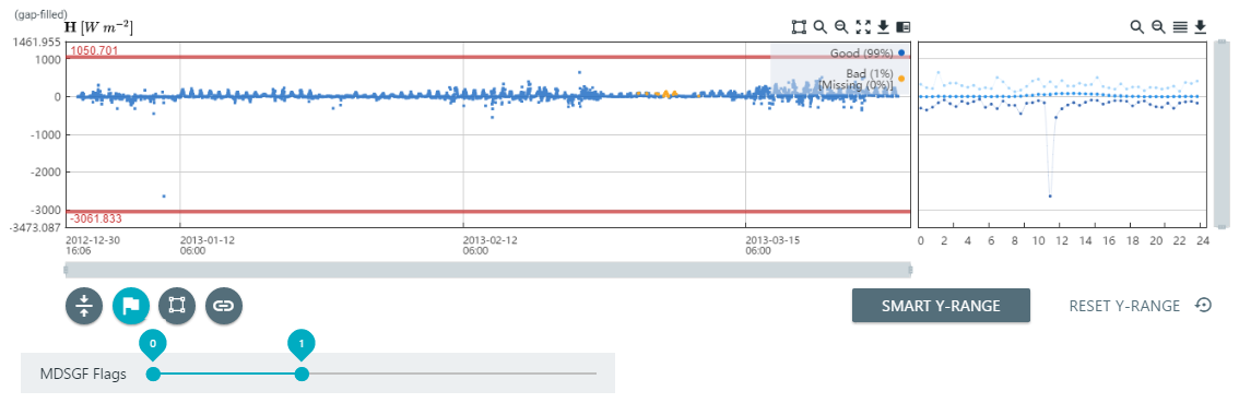
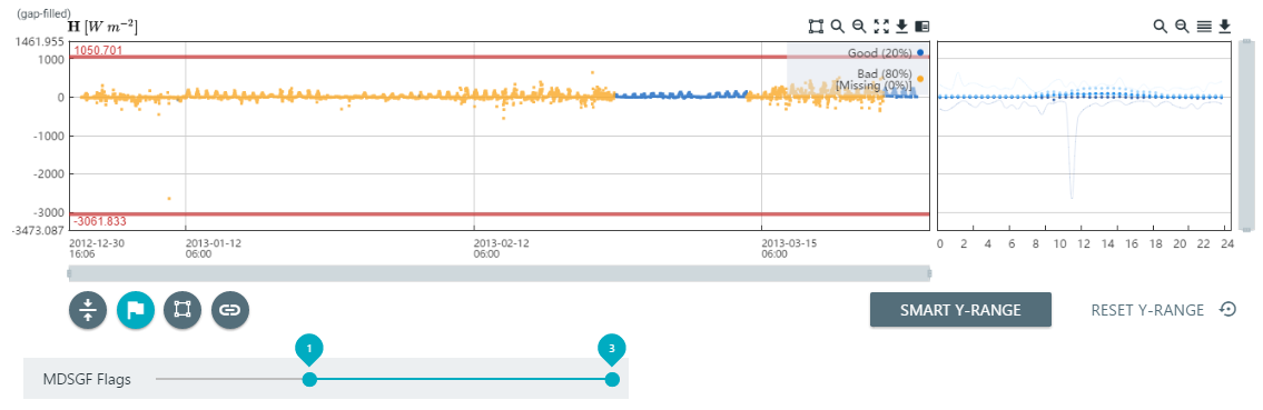
Screening based on MDSGF (Marginal Distribution Sampling) gap fill flags
After you have gap filled data using the Marginal Distribution Sampling technique (see Flux gap filling), you can screen the gap filled data base on flags as described in Reichstein et al. (2005). In this example, the gap-filled H is at the bottom of the Quality Screening tab.
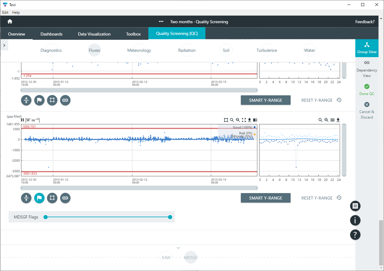
Adjust the slider so that it includes only the desired flag values.
- 0 indicates measured data.
- 1 indicates gap filling data quality A (high).
- 2 indicates gap filling data quality B (medium).
- 3 indicates gap filling data quality C (low).