


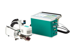
Fluorescence analysis tools
Monitoring real-time fluorescence
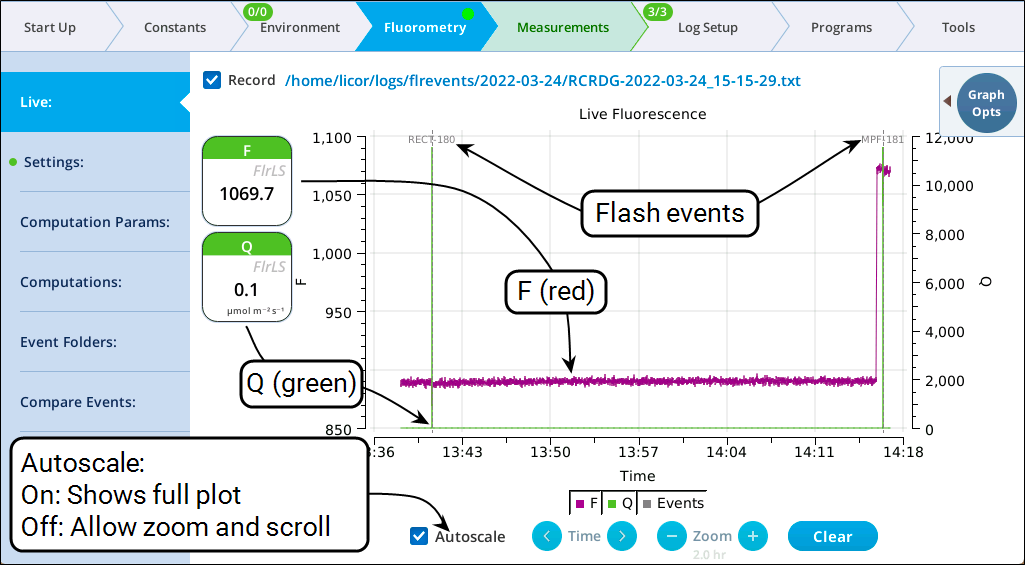
The Live screen for monitoring fluorescence uses a time-of-day bottom axis, and plots modulated fluorescence F and actinic light Q for up to 8 hours. Fluorescence events (saturating flashes, dark pulses) are also marked on this graph as they happen.
Flash operating tips
-
While the Autoscale box is checked, you can quickly zoom in on a part of the graph by simply tapping the graph at that location. The graph will automatically turn Autoscale off and center itself at the tapped time, with the range of the displayed data set by the current Zoom setting. Subsequent left/right shifting and zooming in/out is done by the Time and Zoom buttons. To get back to the full view, check the Autoscale box.
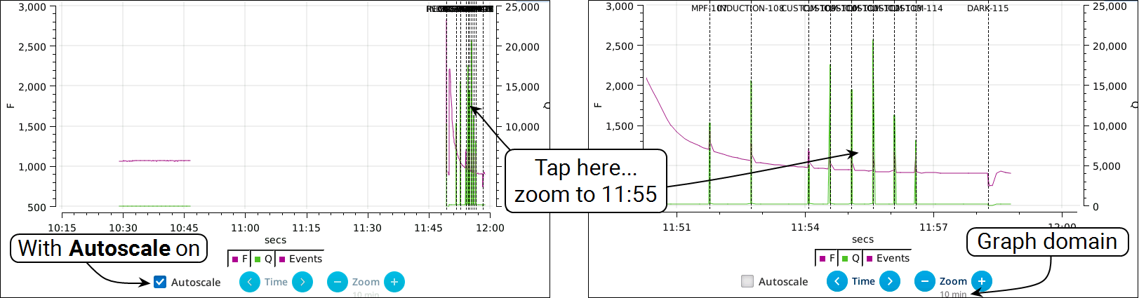
Figure 8‑52. Autoscale on (left) shows whole graph. Tap at 11:55 to zoom in (right). -
While Autoscale is cleared, the graph will remain unchanged if the newest incoming data is not on screen. If the present time is visible, the graph will automatically scroll left each time the incoming data reaches the right edge, keeping the latest x minutes (x = whatever the zoom is set to) visible on screen.
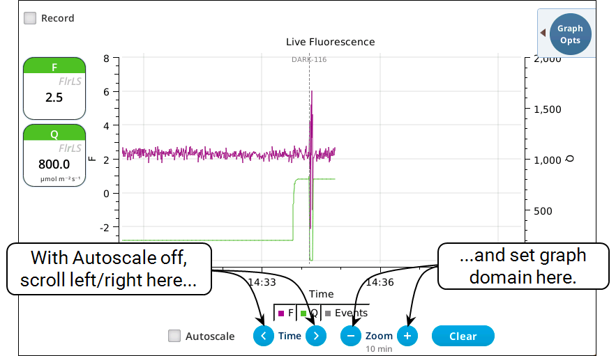
Figure 8‑53. Keeping the previous 10 minutes on screen. -
The Q plot is easily dominated by saturating flashes (e.g., maximum values of 15,000). To maintain a normal actinic scale, open the Graph Opts panel, set Q max to 2000 and check the Q max box.
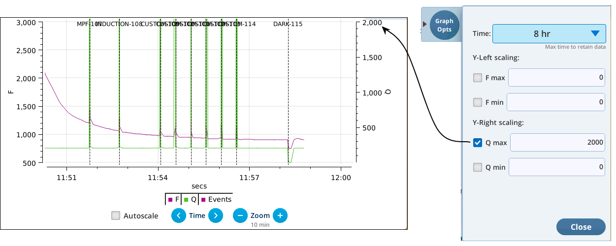
Figure 8‑54. Limit the Q graph to 2000 mol m-2 s-1. -
The Record checkbox replaces the Start/Stop buttons that used to reside on the Measuring Settings page (Figure 8‑55). Record has no influence on the real-time graph, which keeps going no matter what (unless you put the instrument to sleep).
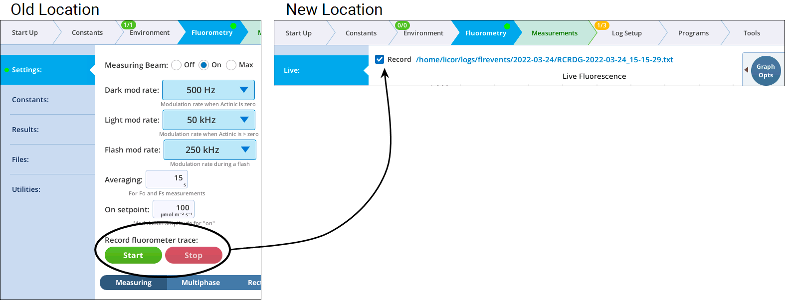
Figure 8‑55. Trace file recording control has moved to the Live screen.
A fluorescence trace file contains tab-delimited records of 9 fluorometer output values. The first line is always a label line.
CODE TIME FLUOR DC PFD RED BLUE FARRED REDMODAVG
1 1642441773.4 951.80 -28.06 0.0499964 0.0 0.0 0.0 0.0499964
1 1642441774.0 949.22 -27.89 0.0499964 0.0 0.0 0.0 0.0499964
1 1642441774.6 945.30 -26.47 0.0499964 0.0 0.0 0.0 0.0499964
1 1642441775.2 943.30 -29.13 0.0499964 0.0 0.0 0.0 0.0499964
1 1642441775.8 938.27 -26.69 0.0499964 0.0 0.0 0.0 0.0499964
1 1642441776.4 939.17 -26.53 0.0499964 0.0 0.0 0.0 0.0499964
Historical record
The Event Folders screen represents a graphical way to explore the contents of /home/user/logs/flrevents, which holds daily directories of fluorescence events and recording files. A date/folder picker allows you to pick the daily folder to be viewed. A label indicates how many recording or events files are found there, and a Plot button causes the contents of the directory to be read and displayed on the graph.
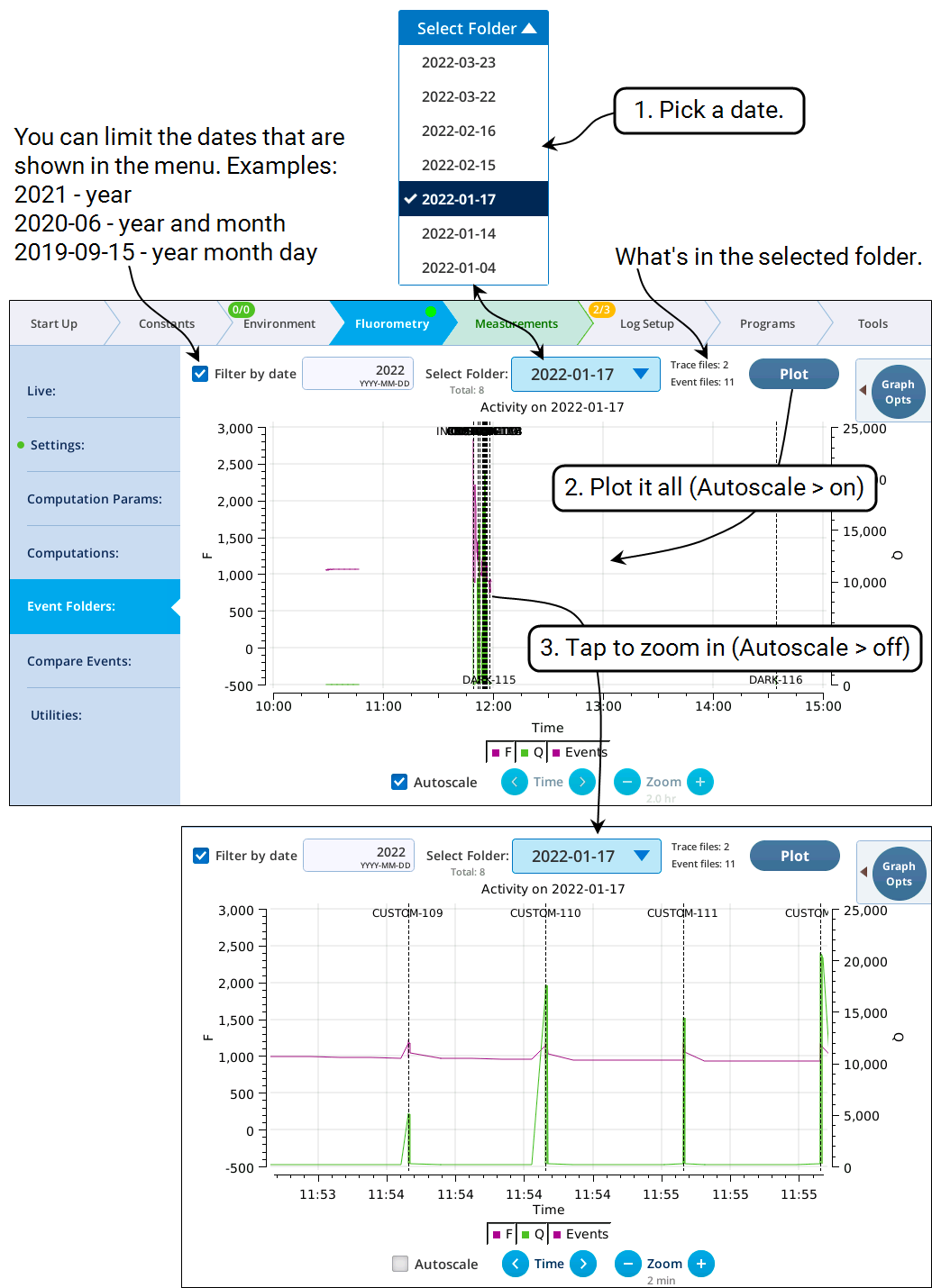
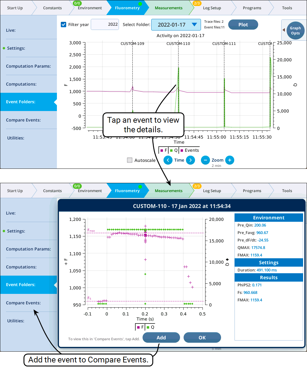
With Autoscale off, tapping the graph close to an event will open a dialog with a plot of the event and related details (Figure 8‑56). If this event is not already in the list of events in Compare events, you can add it simply by tapping the Add button in the dialog. (If it is already there, no Add button will be displayed).
Compare events
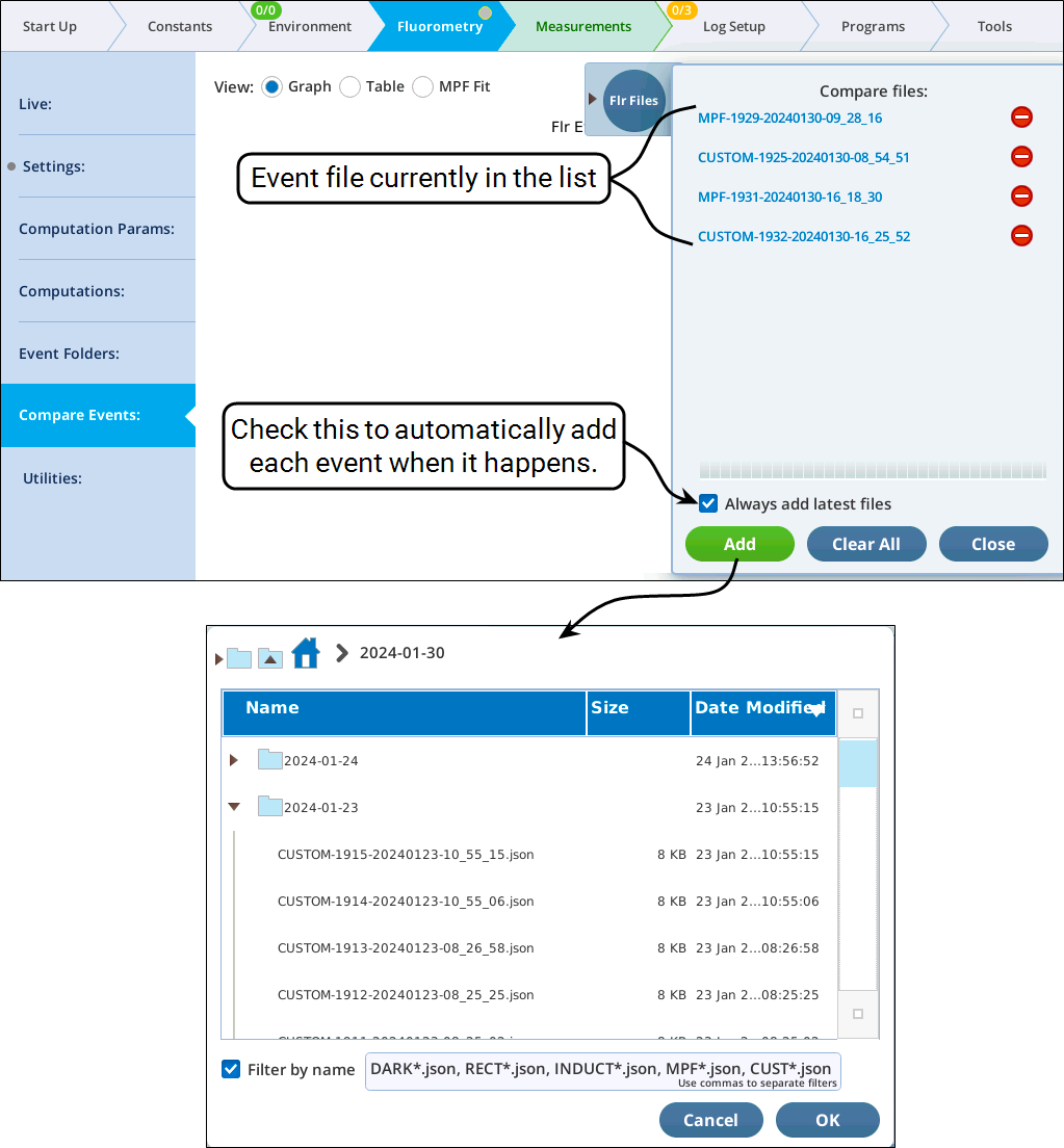
Compare Events provides graphical and tabular expressions of fluorometer event files. The three views provided all share tab Flr Files to a pullout drawer that lists the files presently available for viewing (Figure 8‑58). Files can be added automatically when they occur, or manually with the Add button. They can also be added from historical data (see Historical record).
Graph View
The Fluorometry > Compare Events lets you directly compare flash or dark pulse events. The file pullout drawer (upper right) lets you add or remove events from the list; the graph pullout (lower right) lets you configure the graph appropriately.
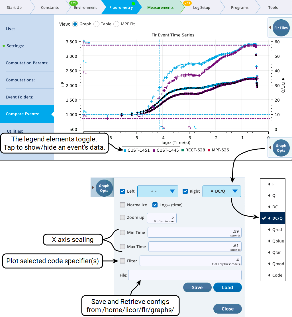
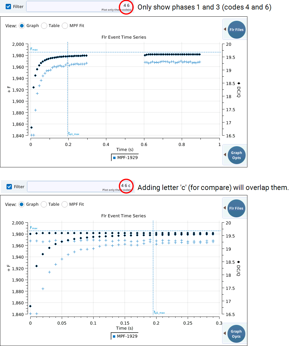
The Filter field in Figure 8‑59 also allows you to specify parts of a flash event to graph. For example, to see a RECT flash without the margin points, specify 3. To plot just the first and third phases on an MPF, specify 4, 6. Table 8‑10 shows code value usage for conventional events. For CUSTOM events, codes have no set meaning, and could be anything from 2 to 53.
| Code | Code Description |
|---|---|
| 2 | Pre-flash margin |
| 3 | RECT or INDUCTION flash |
| 4 | MPF Phase 1 |
| 5 | MPF Phase 2 |
| 6 | MPF Phase 3 |
| 7 | Post-flash margin |
| 11 | DARK pre margin |
| 12 | DARK part 1 |
| 13 | DARK part 2 |
| 14 | DARK part 3 |
| 15 | DARK post margin |
Code specifiers can also include operators (<7 plots all codes less than 7) and Python slice information (3[1:5] plots the 2nd through 5th code 3 values, for example). For complete details, see Code specifiers.
Two examples follow. Figure 8‑60 shows an MPF flash that is filtered to show only phases 1 and 3. The top plot has them on the same time axis, while the bottom axis plots each phase starting from time 0, effectively overlapping them making a direct visual comparison easy.
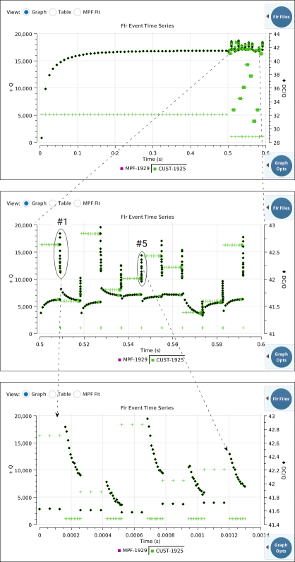
The second example is a bit more complicated. The goal is to examine closely the 10 measurement pulses of an custom flash designed to measure HIQ at a series of light intensities.
|

This unfiltered HIQ response flash has 0.5 secs of Q=5000 (code 2), followed by 10 cycles of codes 22,23,24.
|

Plotting only the code 22, 23, and 24 data, shows more clearly the 10 measurement cycles. The code 22 is an equilibration time to adjust to the new flash intensity, followed by higher sampling in code 23. For code 24, the light drops to 1000 and we record data 13 data values over 104 µs.
|
|

We expand the transition intervals when the light drops to 1000 (code 24), by skipping code 22 data entirely, and plotting only the last 3 values of code 23 data and code 24 data. We do this by adding [14:] in the filter line, which means skip the first 14 points of each data group. The `cs' in the filter ("compare sequentially") skips the times between the 10 data groups. Finally, we add slice information ([0:5] to the 'cs' to just show the first 5 cycles. |
Table View
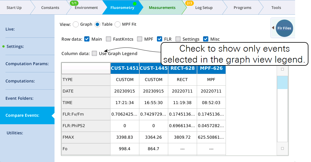
The Table view (Figure 8‑62) provides a method to view flash file data in table form. The available rows of the table are listed in Table 8‑10, and are selectable by check-box. The columns of the table can either be all files loaded, or just the ones selected in the Graph view legend filter.
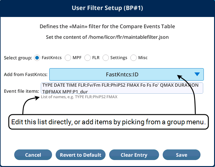
The contents of the Main data filter are user definable, via the BP app apps/utilities/SetMainTableFilter.py (Figure 8‑63).
MPF fit view
The MPF Fit View (Figure 8‑64) shows the phase 2 analysis for MPF flashes (and CUSTOM flashes that have it).
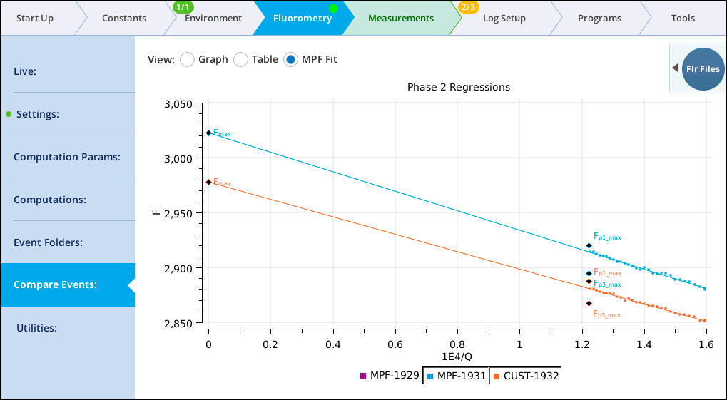
The analysis includes:
-
Phase 2 data: F plotted against 104 / Q. In a flash file, F is
FLUOR, and Q isPFD. -
Regression line: slope and intercept, labelled
MPF:P2 SLPandMPF:P2 INTin the flash file. -
Fmax: the maximum of
MPF:P2 INTandMPF:P1 Fmax, labelledFMAXin the flash file. -
Fp1_max: Measured maximum fluorescence in phase 1, labeled
MPF:P1 Fmaxin the flash file. -
Fp3_max: Measured maximum fluorescence in phase 3, labeled
Fmax_MPF:P3 Fmaxin the flash file.
Ideally, measured values of Fp1_max and Fp3_max are close to the predicted value (i.e., the regression line).